How to write cursive H and h
Capital H is two slanted stems with a small sideways loop joining them at the middle. Lowercase h is a tall loop, a stem, and a rounded hump at the midline.
Capital H
Tall: baseline to topline.
Just below the topline, on the left, with a small curl.
On the right, just below the midline. In this font the pen lifts before the next letter.
Lowercase h
Tall: baseline to topline.
At the baseline, on the left.
Low on the right, swinging up.
In the lowercase h, the hump starts from the stem and comes back down on a second stem. Keep the two stems parallel. The loop at the top is what makes it an h instead of an n.
Common mistakes with capital H
- The crossing loop does not reach the first stem, so the H falls into two separate pieces.
- The loop is drawn big, so it looks like a third letter between the stems.
- The two stems do not slant the same way.
Common mistakes with lowercase h
- The hump starts from the baseline instead of retracing the stem, leaving a gap.
- A small loop is drawn in the hump, so the h reads as a k.
- The loop is drawn wide, so the letter spreads into its neighbours.
Joining h to other letters
Capital H lifts before the next letter, so start the second letter fresh. Practice the lowercase pairs until each join feels like one movement.
Print a practice sheet for H and h
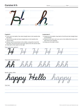
The sheet has the numbered stroke guide for both letters, rows to trace, two practice words and a blank row for writing on your own.